Kungsgatan 28
111 35 Stockholm
Sweden

SIMON KAMRAS
Managing Director/Founder
+46 72 316 00 53
Simon.kamras@supertuesday.se

YASHAR NIKNAM
Creative Director / Founder
+46 72 311 00 53
yashar.niknam@supertuesday.se

Christofer Weider
Art Director / Partner
+46 70 996 31 57
christofer.weider@supertuesday.se

Gårdschips Gårdschips Gårdschips Gårdschips Gårdschips Gårdschips

Crafted premium chips from Halland.

Client:
Exotic Snacks

Market:
Sweden

Design strategy
Packaging design
Visual identity
Art direction

Background / Insight

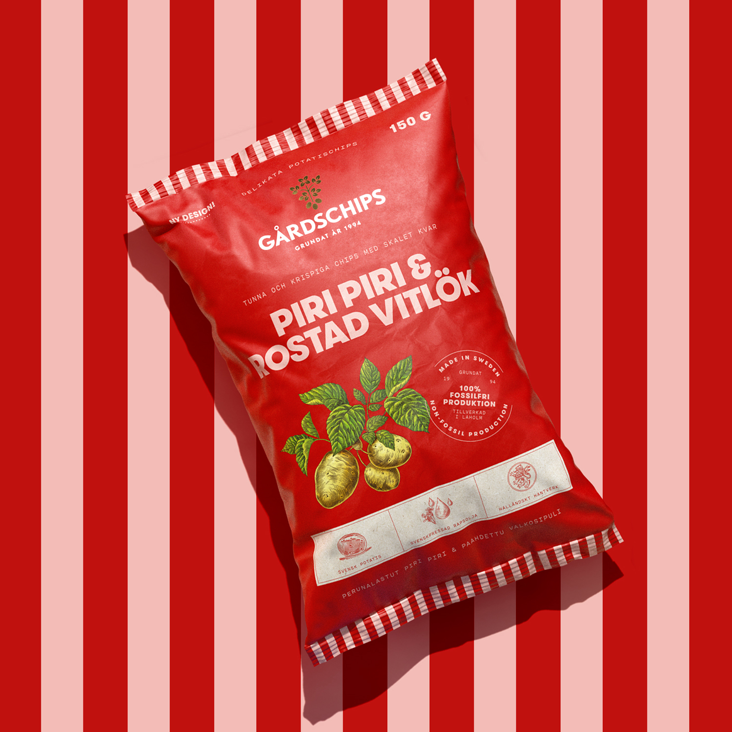
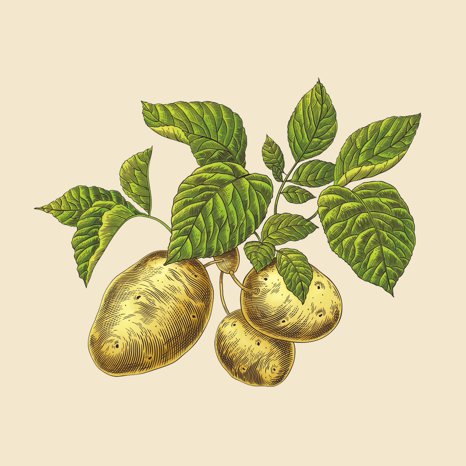
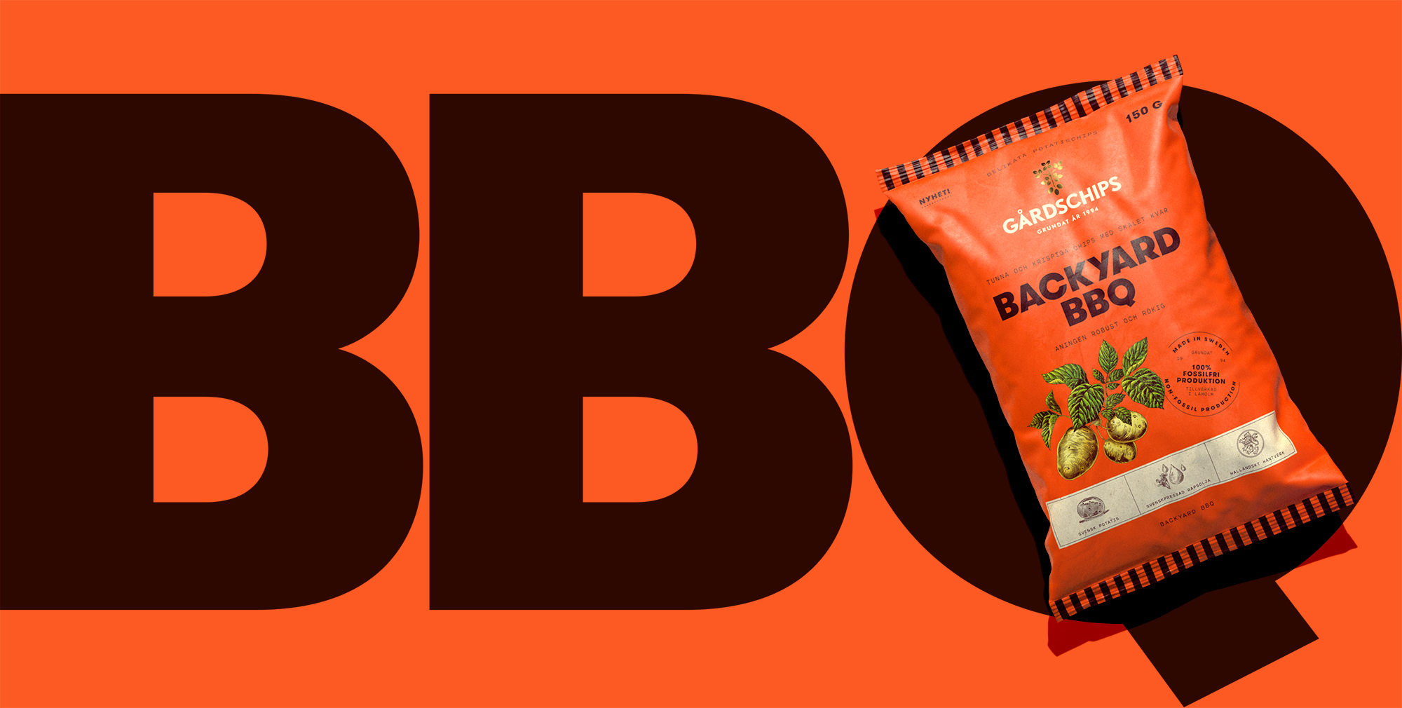
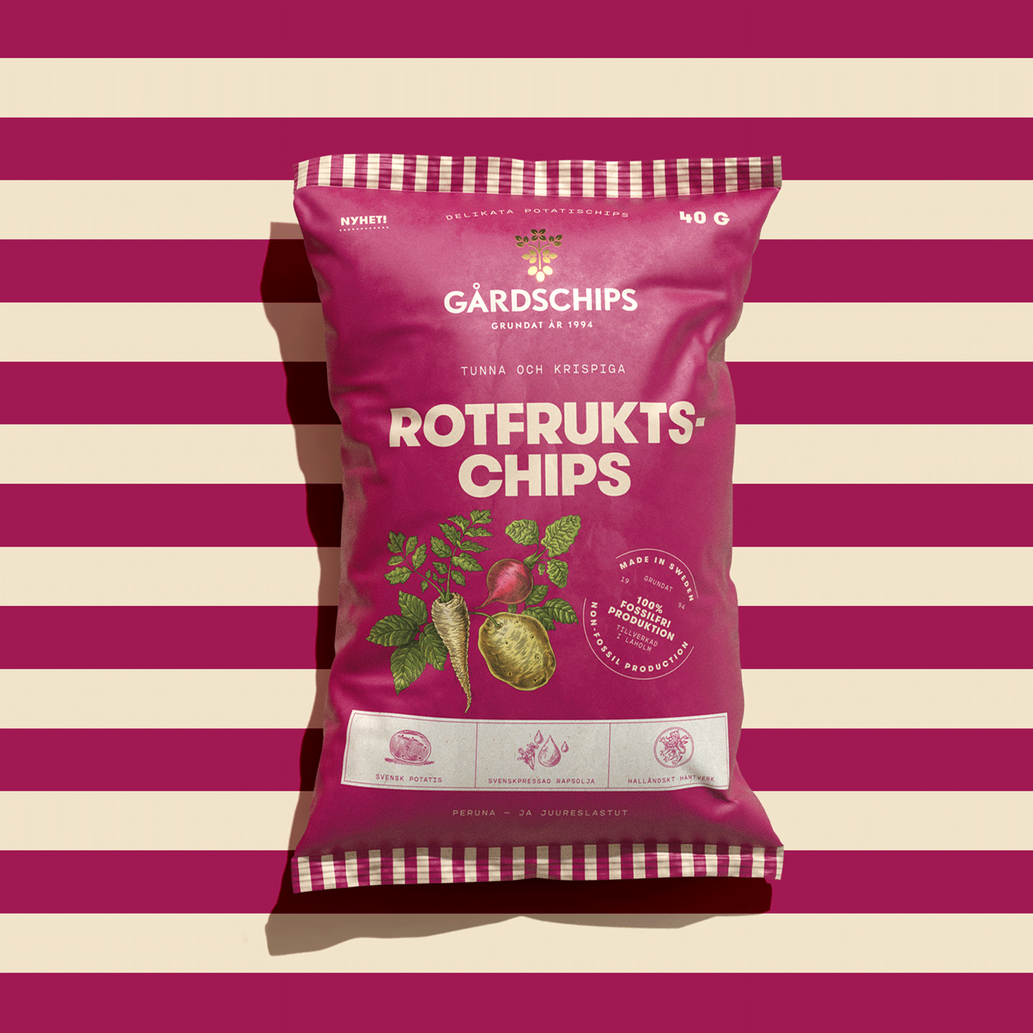
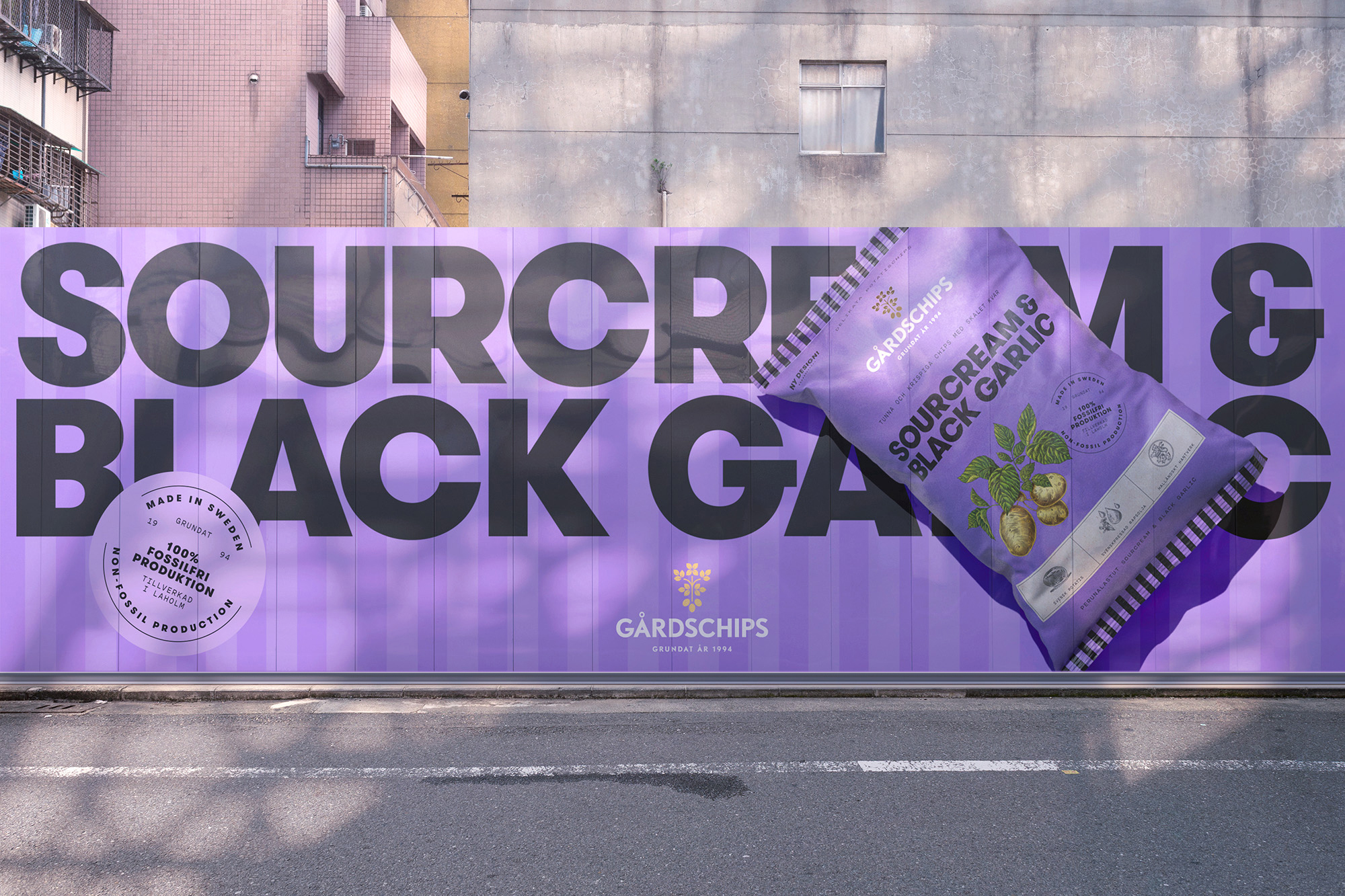
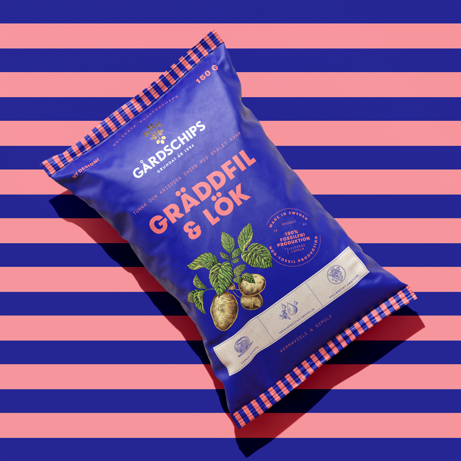
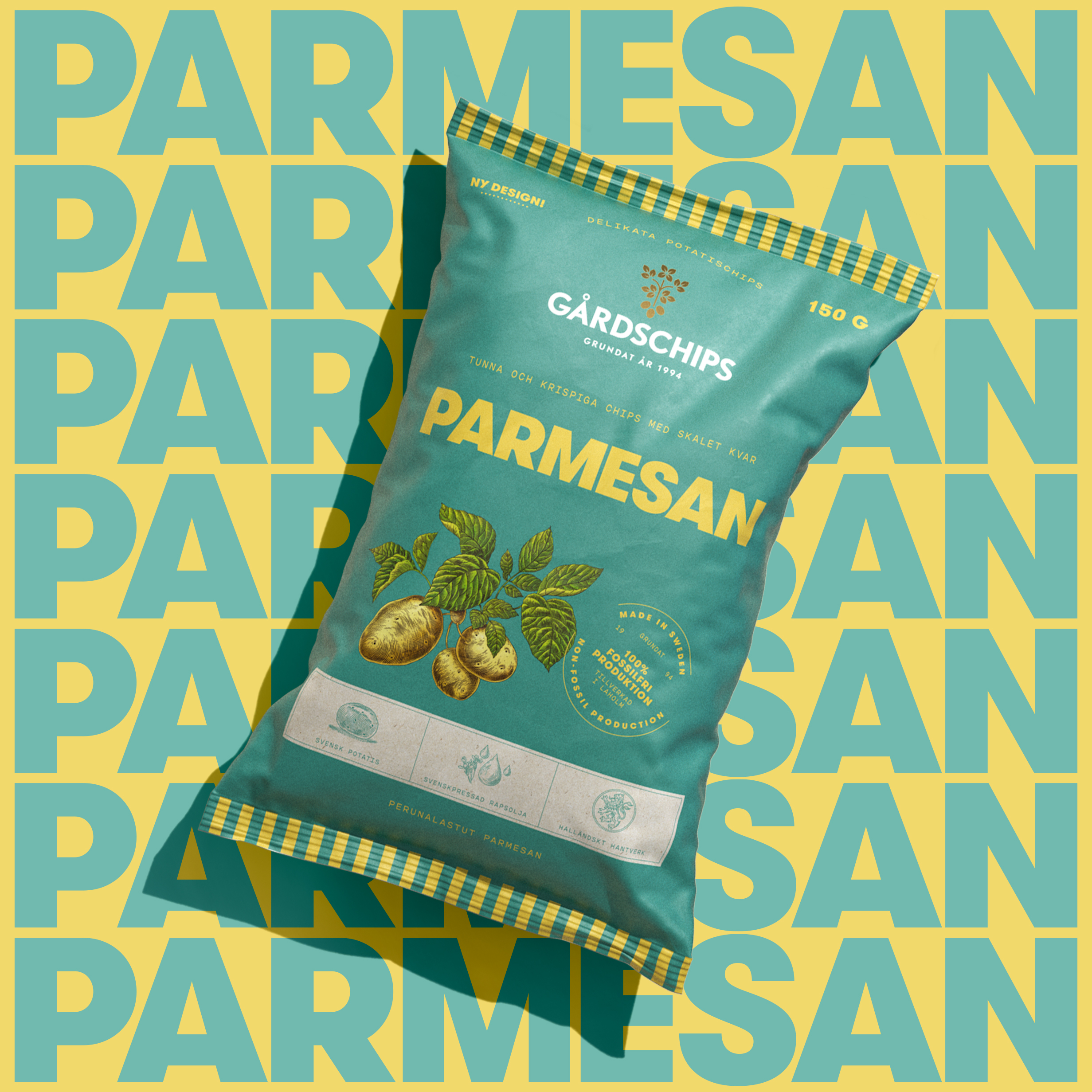
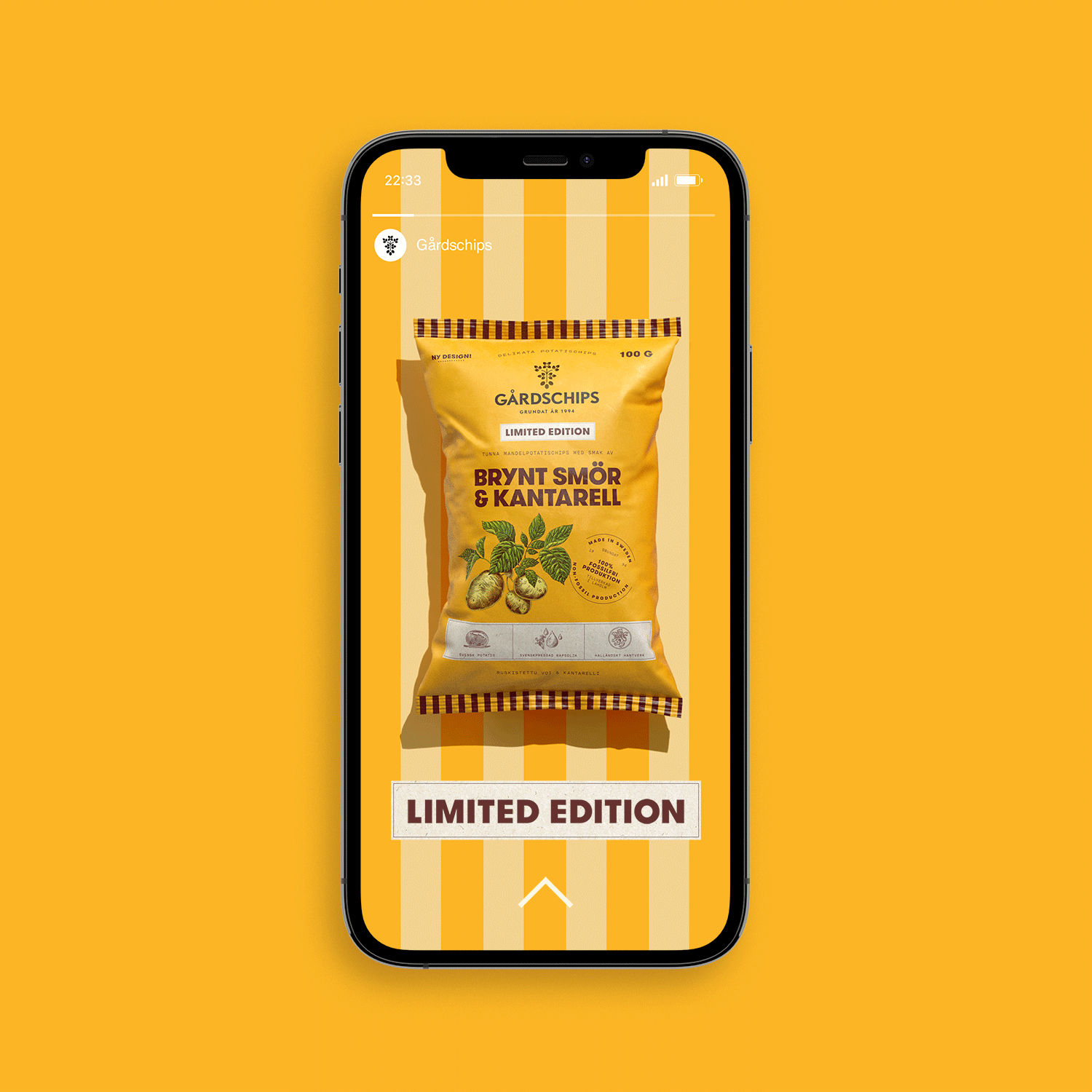
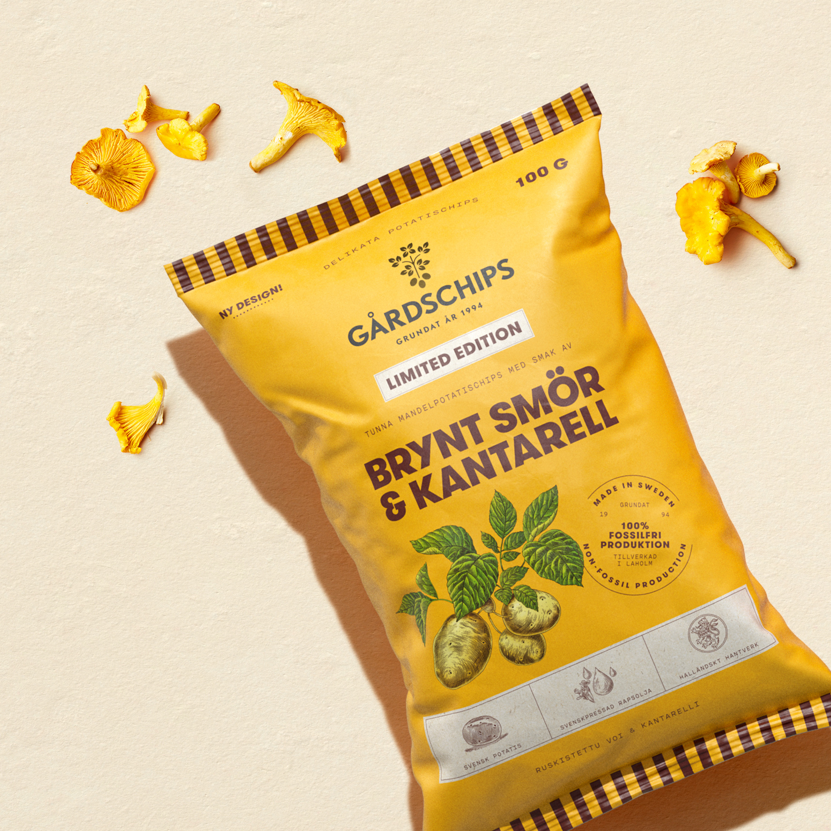
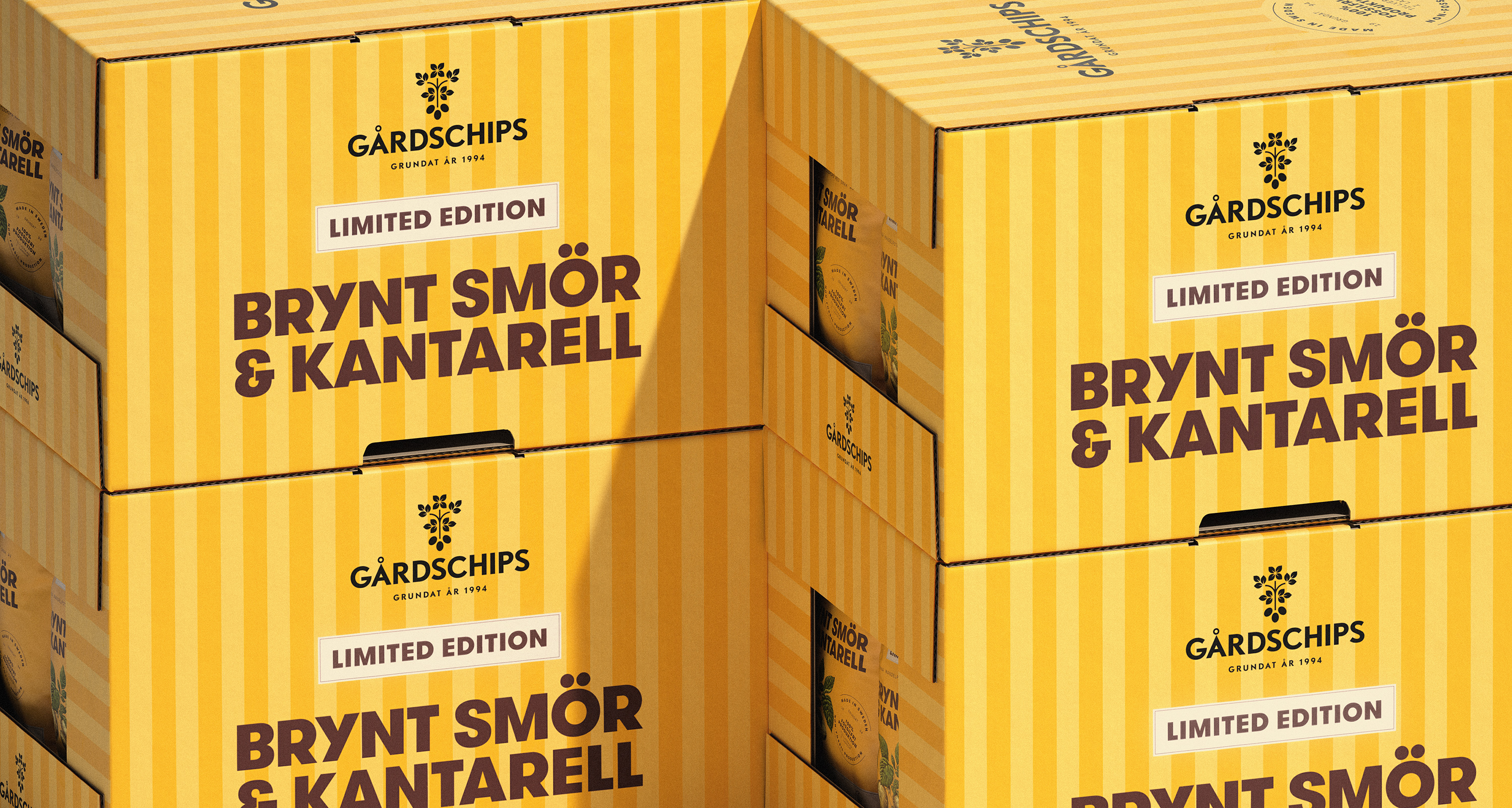
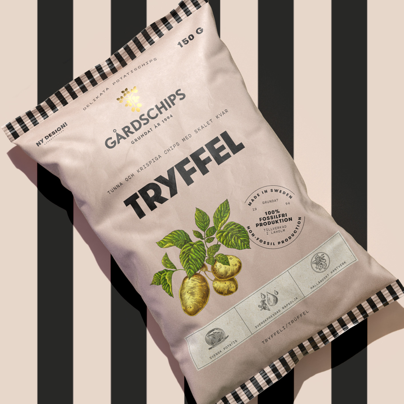
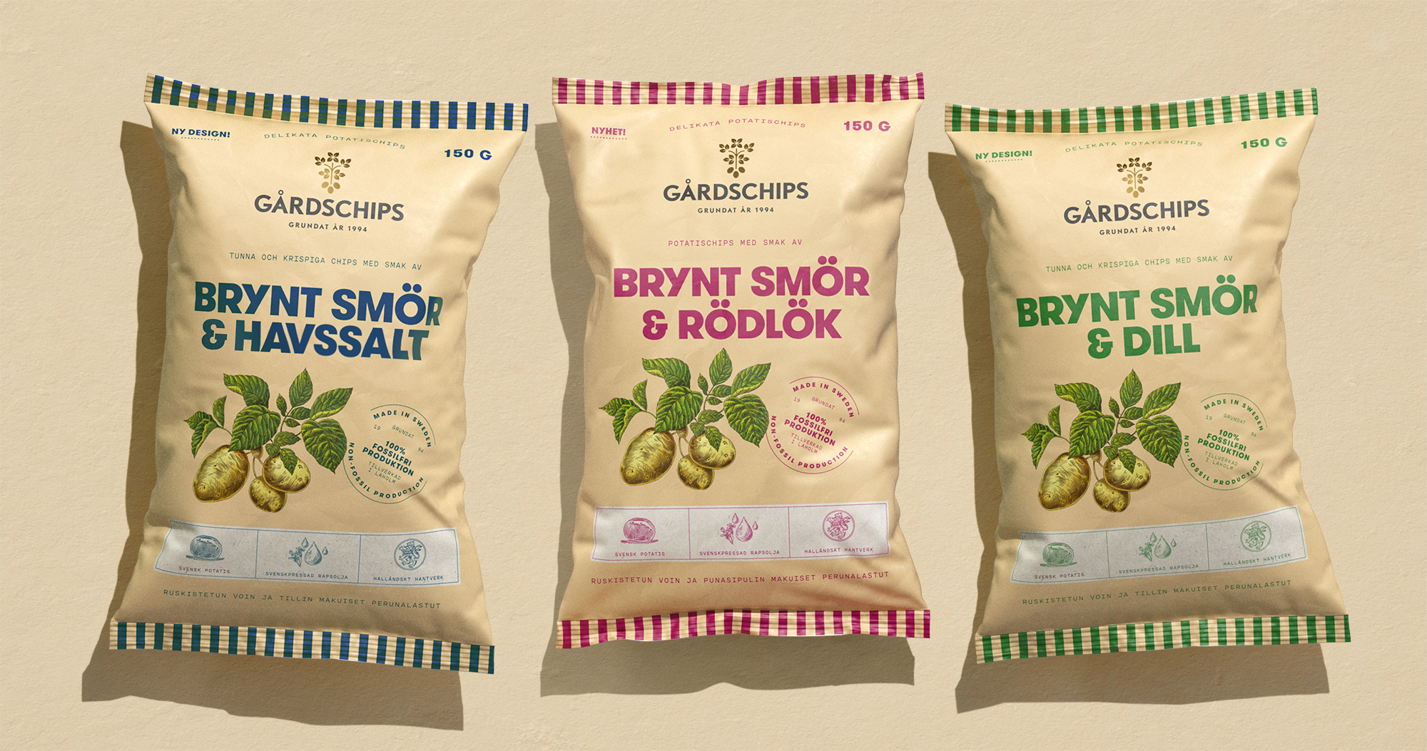
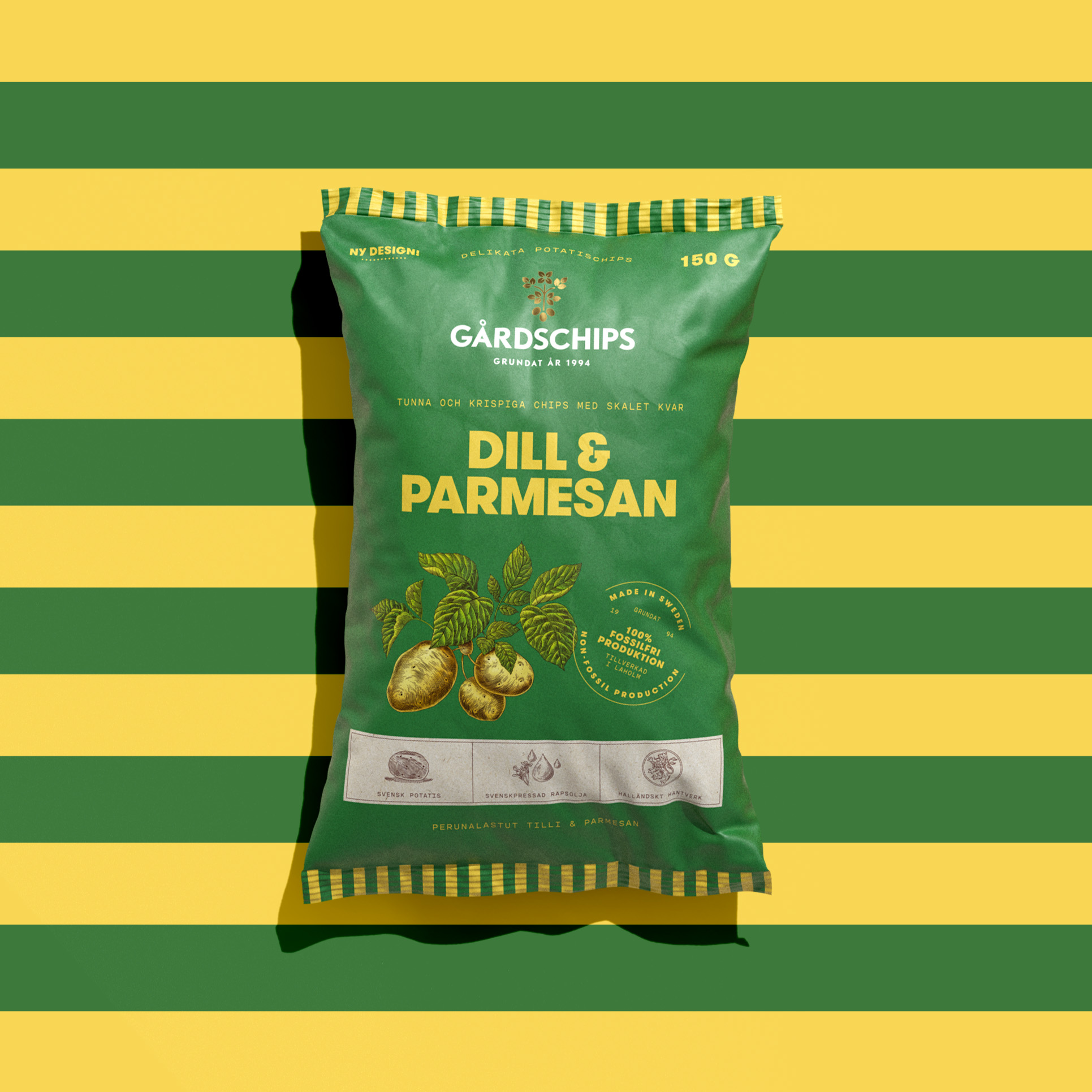
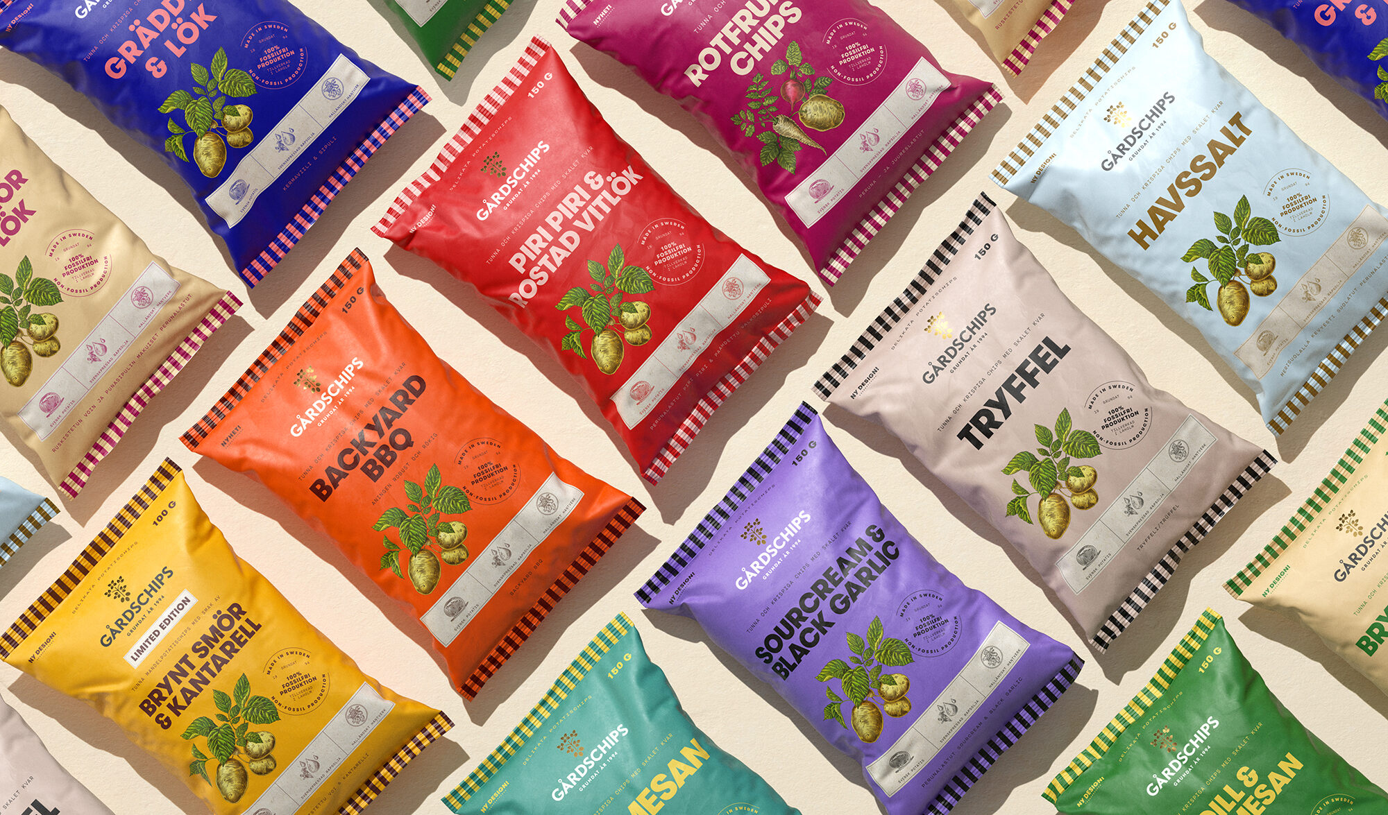
Gårdschips is a brand known for fantastic crisps, that comes in many exciting flavors such as Parmesan, Backyard BBQ and Browned Butter & Sea salt. The production has always been in Halland, in the south part of Sweden, where the potatoes grow just outside the factory. The competition in this category is massive, where especially two aggressive dragons exist. Gårdschips is one of the clear underdogs. Being an underdog means that you must do things differently. Otherwise the game is lost. Gårdschips has truly fantastic products but felt that the design was not bold enough to get the attention that they deserve. They therefore came to us at Super Tuesday with a vision to stand-out more in shelf, and really working towards a look that could dare to be different. A design that would boost both sales and strengthen the brand. That was the task to solve.

Read more

Solution

Gårdschips needed a re-design that would both build the brand in a consistent way, as well as put enough focus on each of the flavors. The approach was to do a design revolution, where “simple and bold” was used as the guiding principles. It was of great importance to find a balance in the design, meaning both create tools that helps the products to stand out but at the same time capture the authenticity and naturalness of this high-quality product portfolio. The only real asset that was kept was the logotype. Except from that we created a totally new design system, well suited for all current flavors as well as new product launches. Through a new bold typeface, vibrant colors for each crisp-bag and handmade illustrations – we developed a totally new look for the portfolio. The first feedback from salesmen around Sweden is that the re-design, in combination with new product launches, has got wonderful reviews, and they feel confident that this will soon be shown through increased sales figures.