Kungsgatan 28
111 35 Stockholm
Sweden

SIMON KAMRAS
Managing Director/Founder
+46 72 316 00 53
Simon.kamras@supertuesday.se

YASHAR NIKNAM
Creative Director / Founder
+46 72 311 00 53
yashar.niknam@supertuesday.se

Christofer Weider
Art Director / Partner
+46 70 996 31 57
christofer.weider@supertuesday.se

Froosh Froosh Froosh Froosh Froosh Froosh

Giving the fun — loving fruit innovator a new fresh identity!

Client:
Carl Fazer

Market:
Nordic

Design strategy
Packaging design
Visual identity

Background / Insight

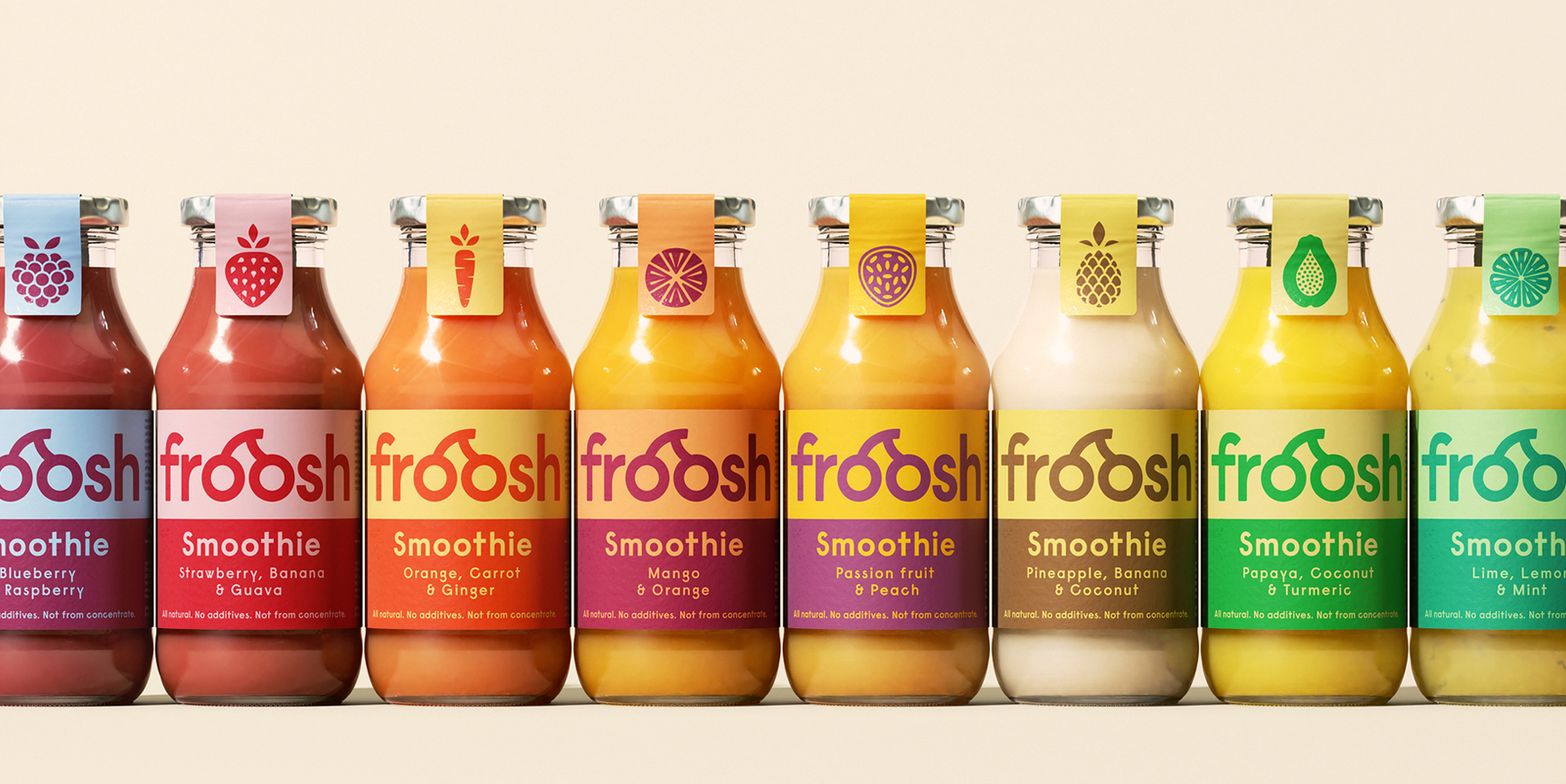
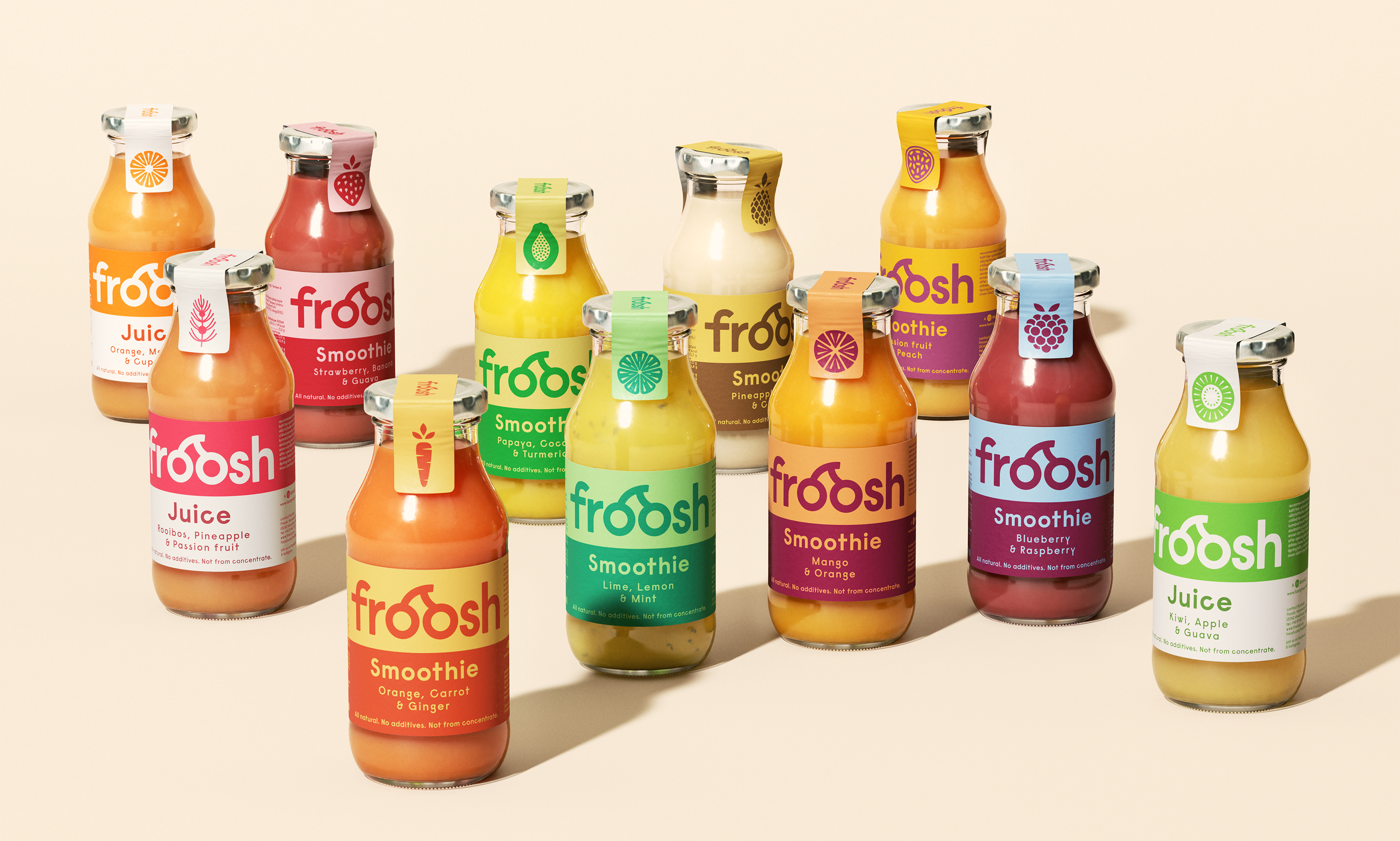
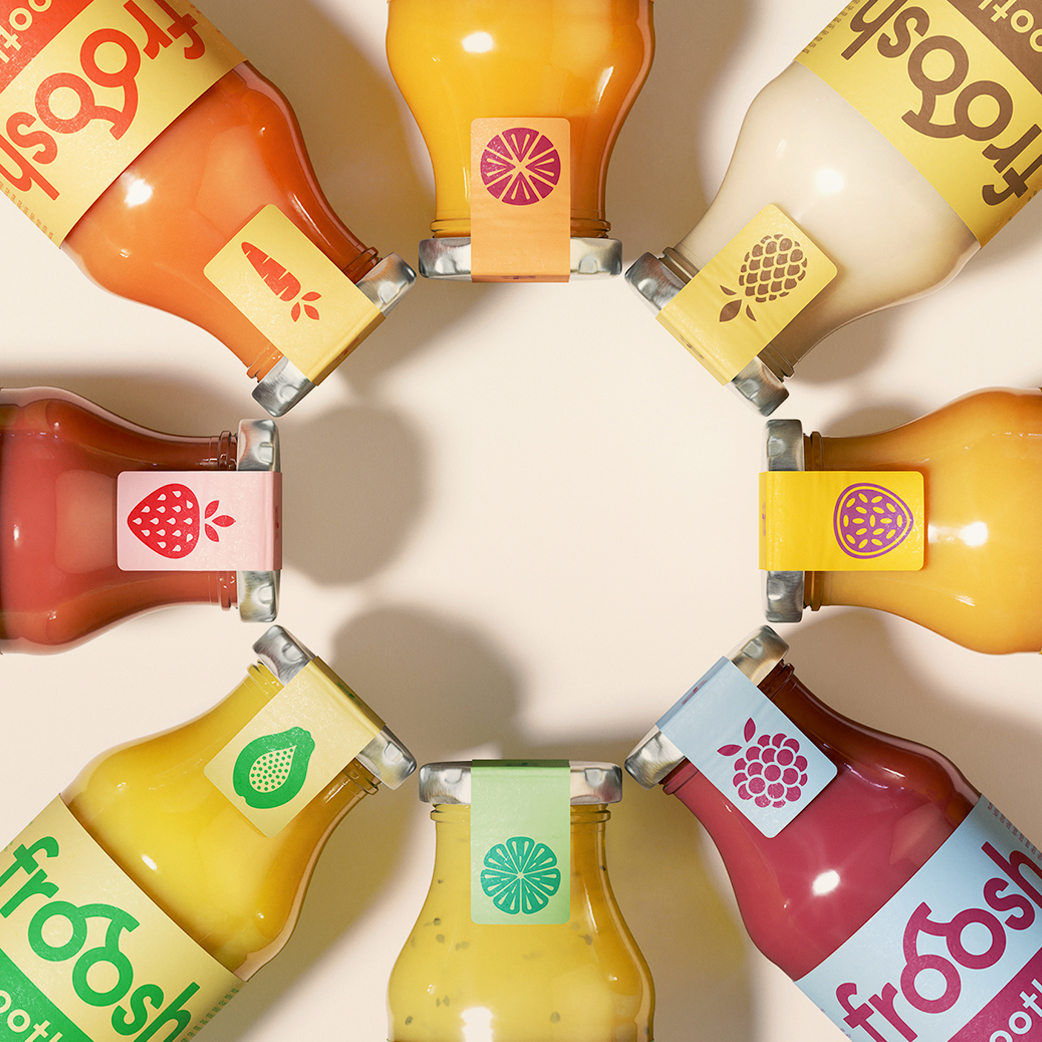
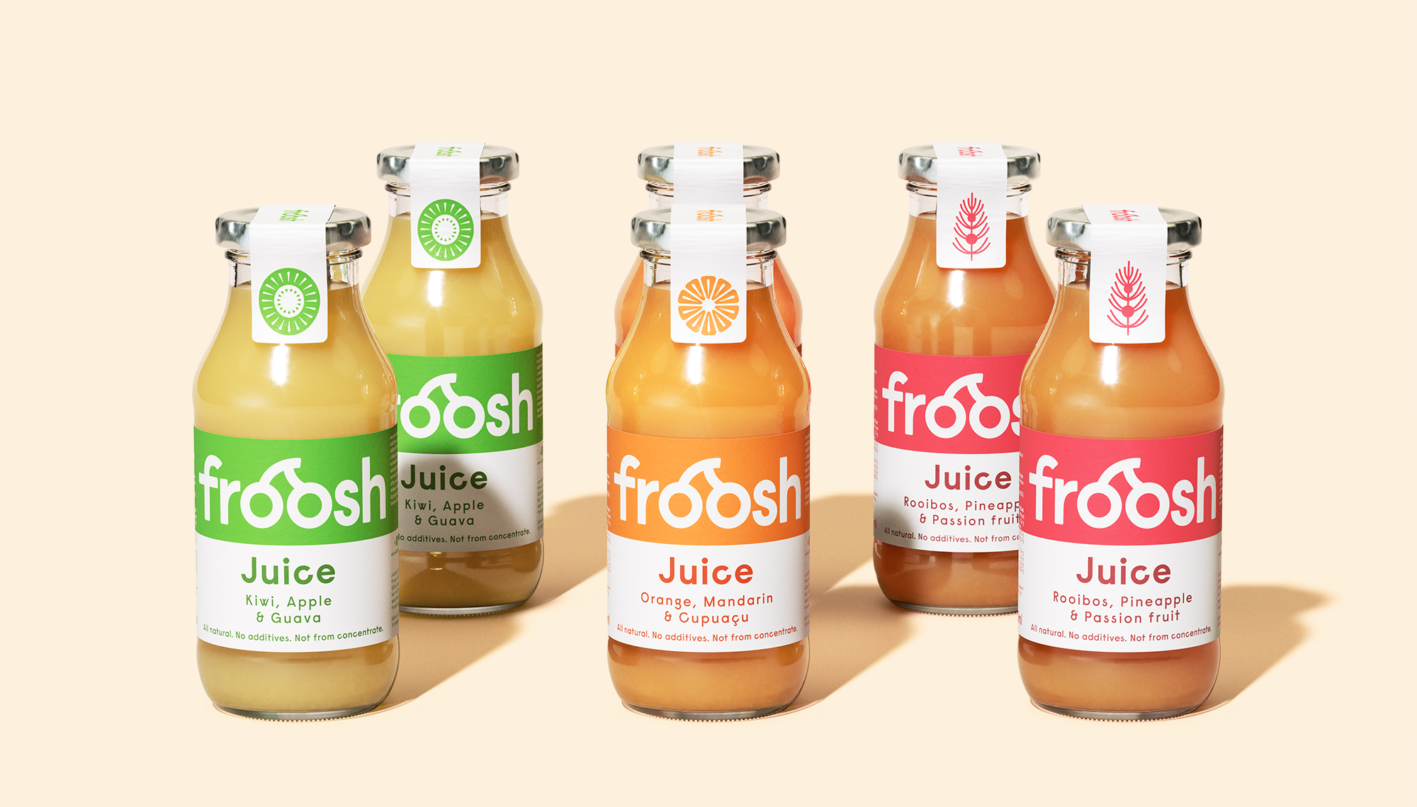
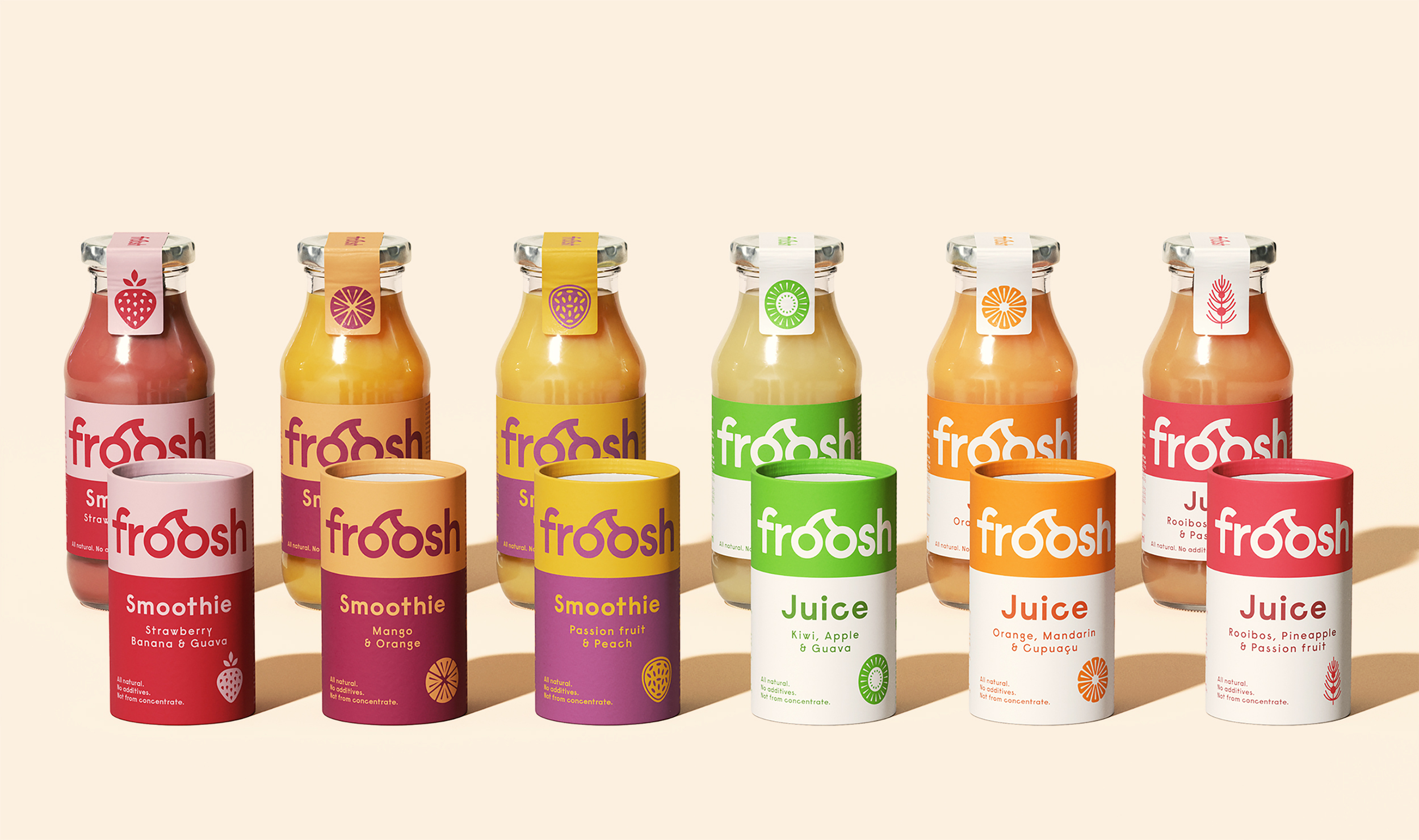
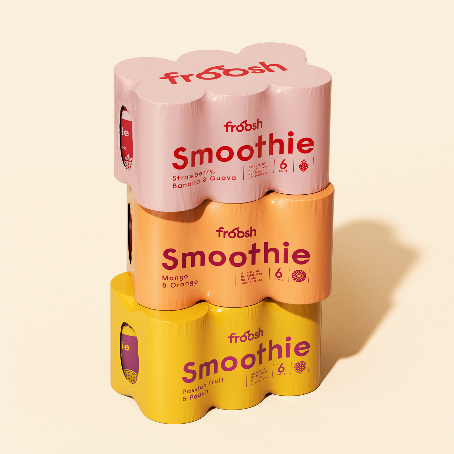
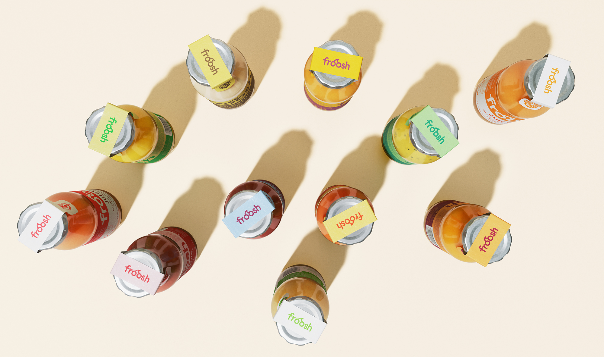
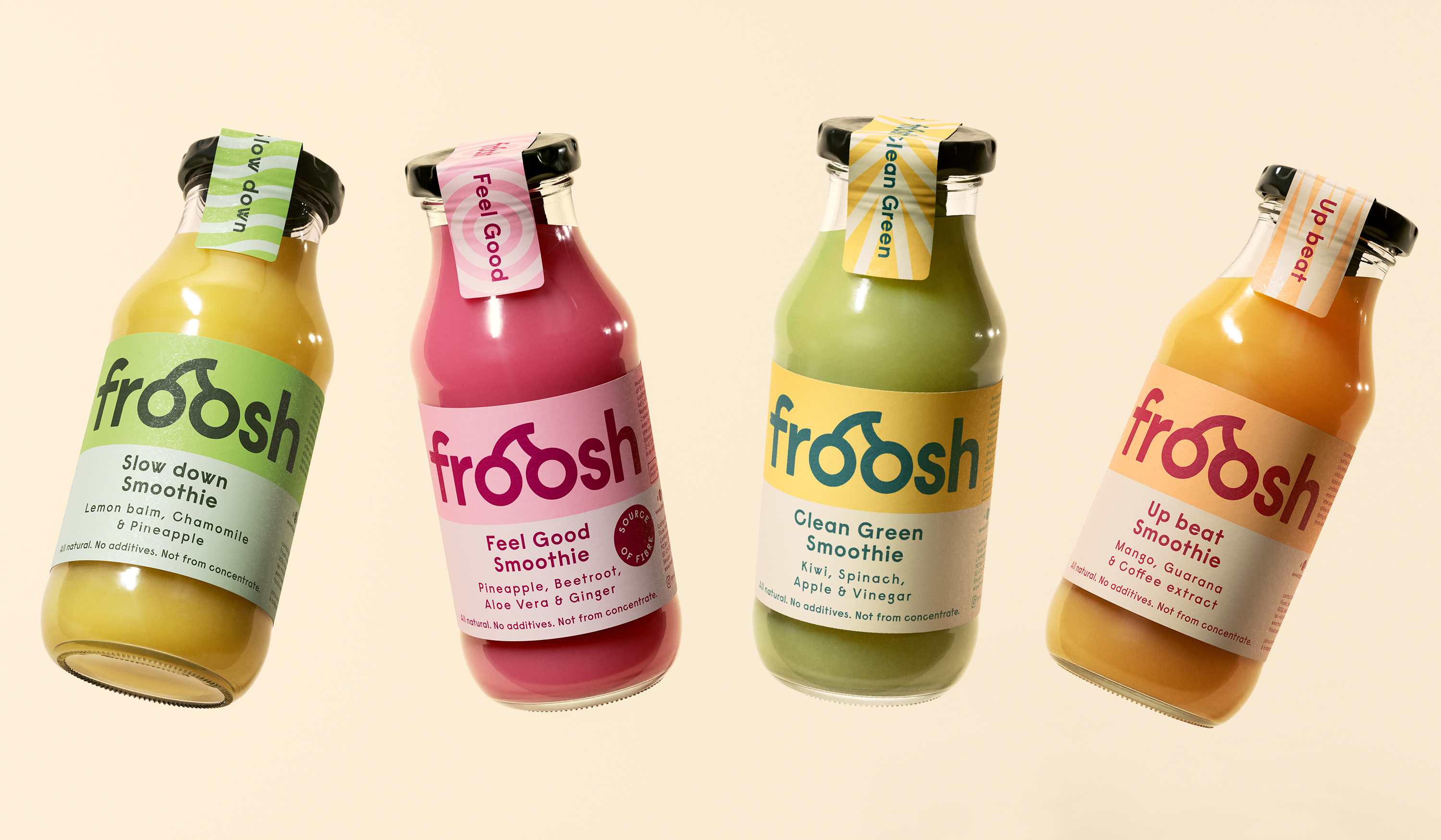
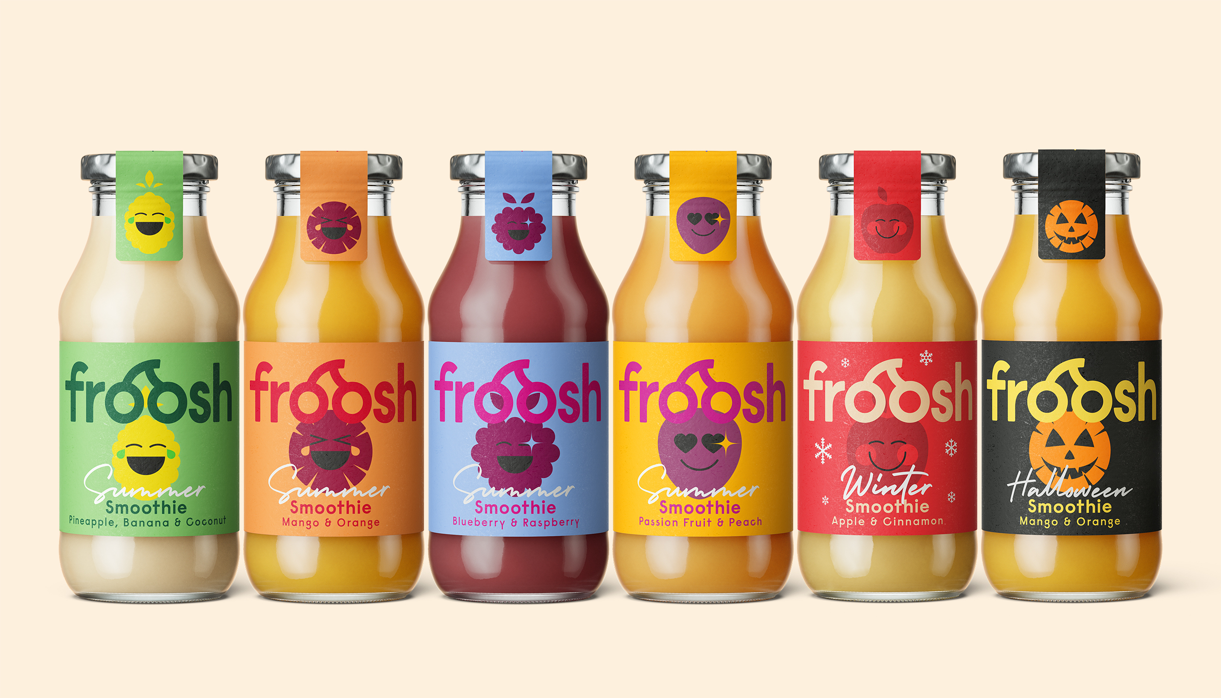
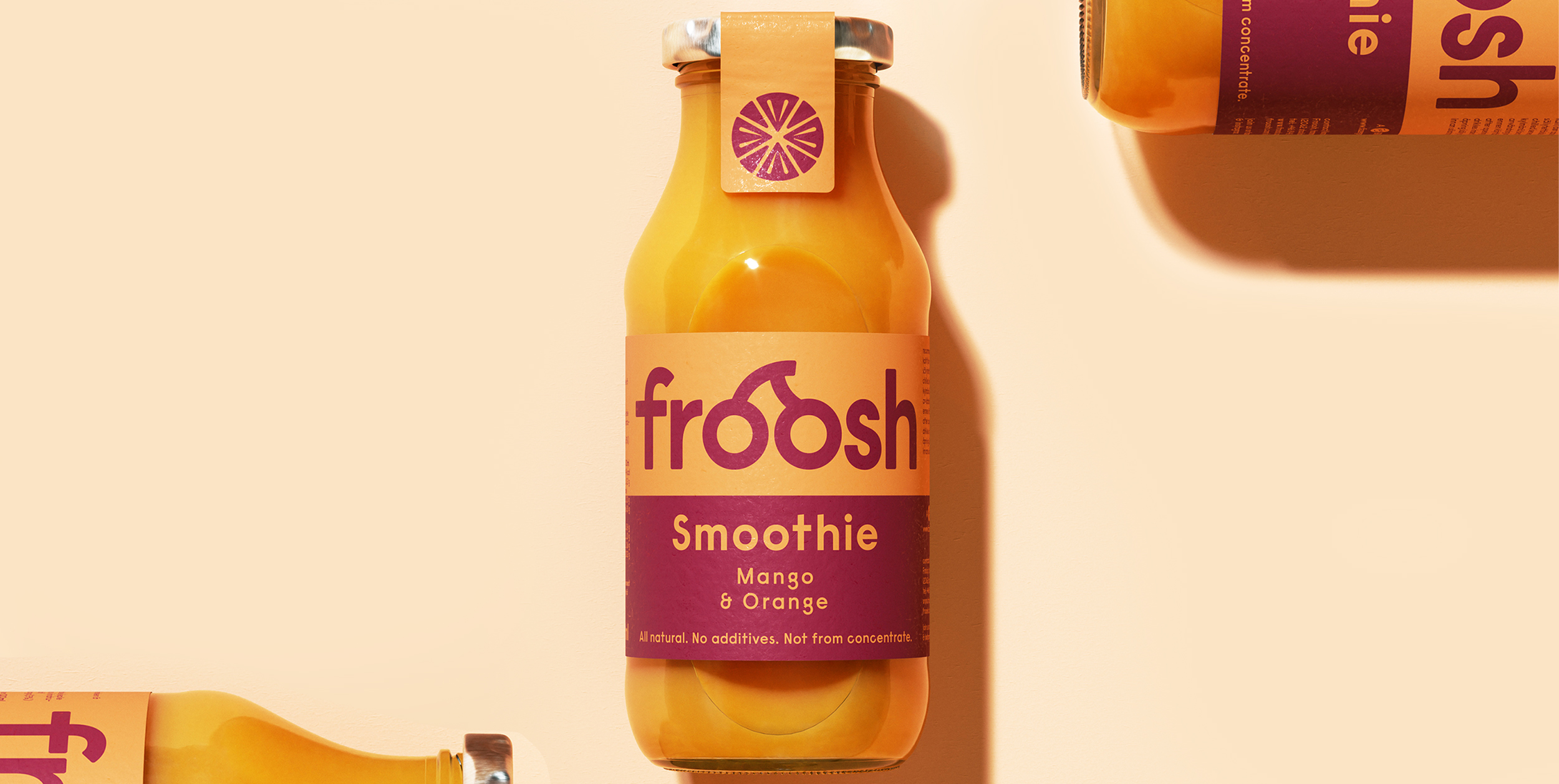
Froosh is a confident brand known for colourful, glass bottled smoothies with wacky, brand carrying copy. Ever since the launch in 2008, Froosh has been a proud producer of high-quality products made of 100% fruit without any concentrates, added sugar or preservatives. Today’s consumers are more health aware than ever before. It’s not just about eating healthy, it’s about making it part of your lifestyle. The client had been suffering from low brand and product perception, and growing competition. Research confirmed this and also indicated that the design felt outdated and unclear. This was the task to solve.

Read more

Solution

Froosh needed a rebrand that would clarify the product category, the flavours and all the benefits that comes along with drinking 
a Froosh. The update also needed to strengthen brand recognition in order to create a bond between the brand and the customers. 
We created a thorough packaging design together with an aligned brand identity that reflected the brand’s fun-loving fruit innovator persona. The new design is still joyful, giving voice to all the colours of the brand, but with a stronger design structure and 
a more single minded and bold approach. Now, Froosh can become the natural choice of healthy and tasty beverages.