Kungsgatan 28
111 35 Stockholm
Sweden

SIMON KAMRAS
Managing Director/Founder
+46 72 316 00 53
Simon.kamras@supertuesday.se

YASHAR NIKNAM
Creative Director / Founder
+46 72 311 00 53
yashar.niknam@supertuesday.se

Christofer Weider
Art Director / Partner
+46 70 996 31 57
christofer.weider@supertuesday.se

7 ELEVEN 7 ELEVEN 7 ELEVEN 7 ELEVEN 7 ELEVEN 7 ELEVEN

Re — design of an icon.

Client:
Reitan Convenience

Market:
Sweden

Design Strategy
Packaging design
Structural design

Background / Insight

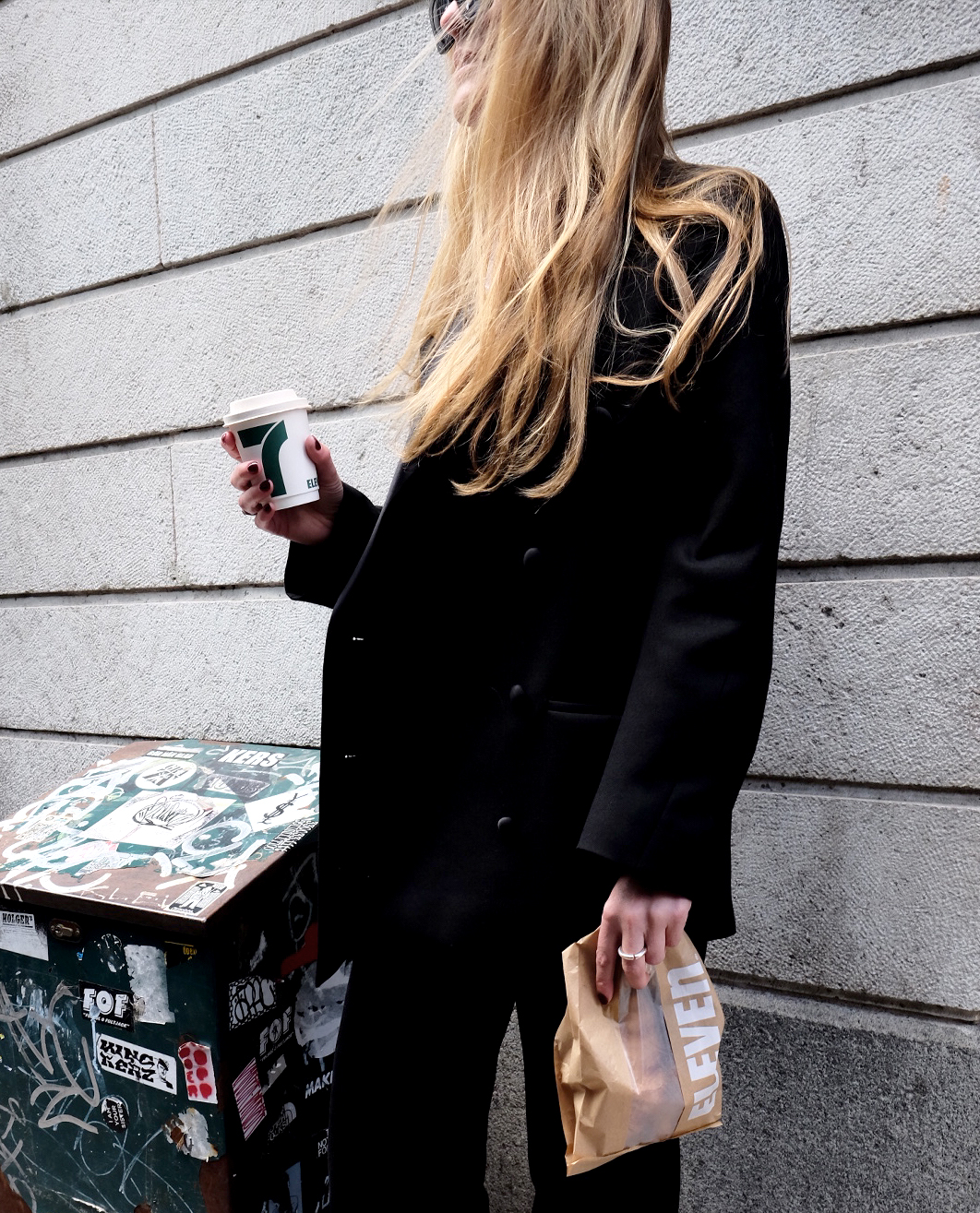
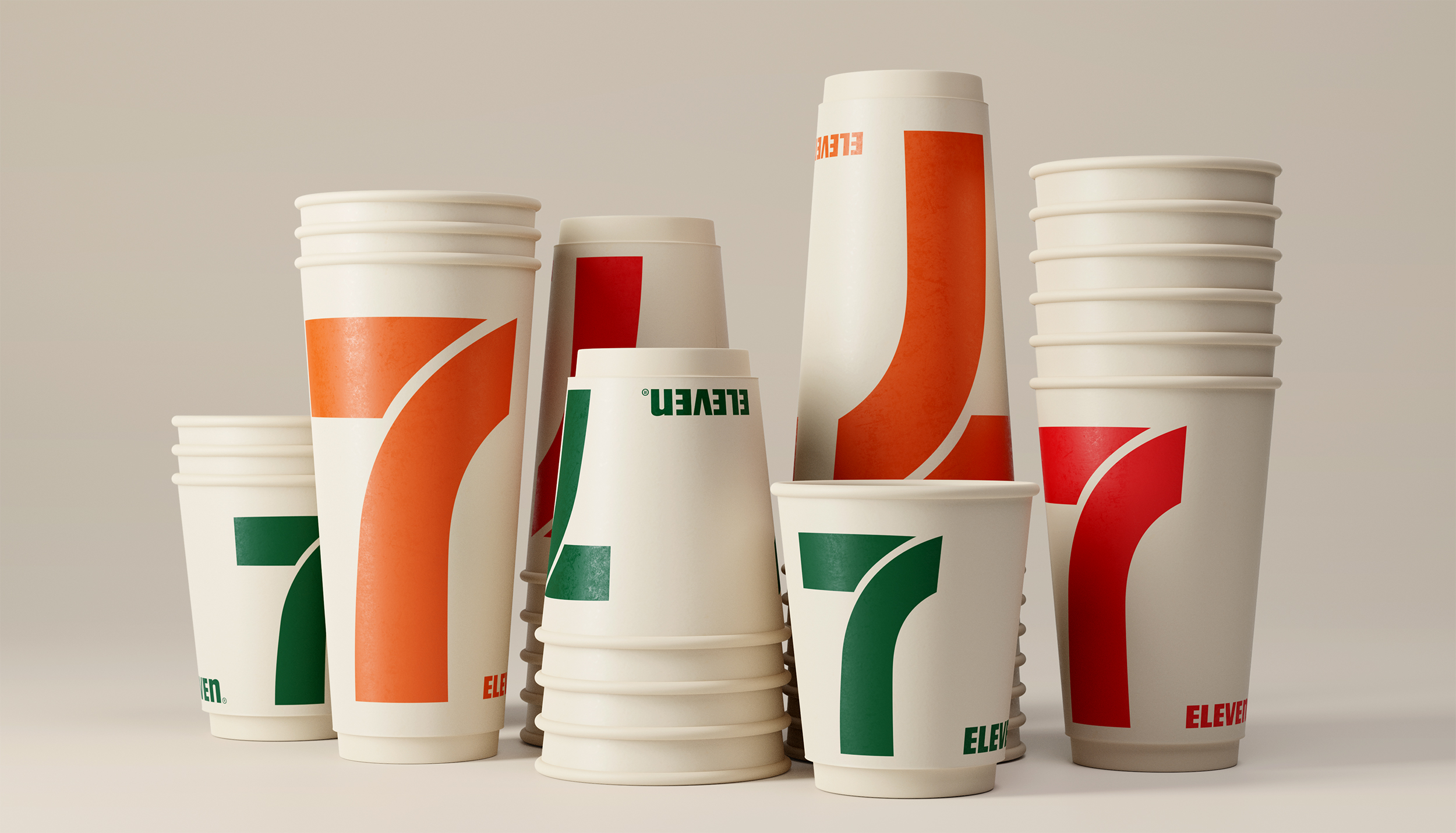
7-Eleven, a chain of convenience stores in Sweden owned by Reitan, operates nearly 90 locations across the country. The company is dedicated to meeting the needs of people on the go and is continuously expanding its presence. Throughout their history, 7-Eleven has prioritized speed and efficiency to enhance the everyday lives of their customers. Some years ago, we undertook a design project focusing on Pressbyråns on-the-go materials, which is Sweden's largest convenience store. When 7-Eleven decided to update their packaging design, which had remained unchanged for many years, they approached us to lead the project. Drawing from our previous experience working with Pressbyrån and our understanding of the stakeholders involved, we saw an exciting opportunity to create a significant and impactful change. However, the question remained: what should the new design look like?
Read more

Solution

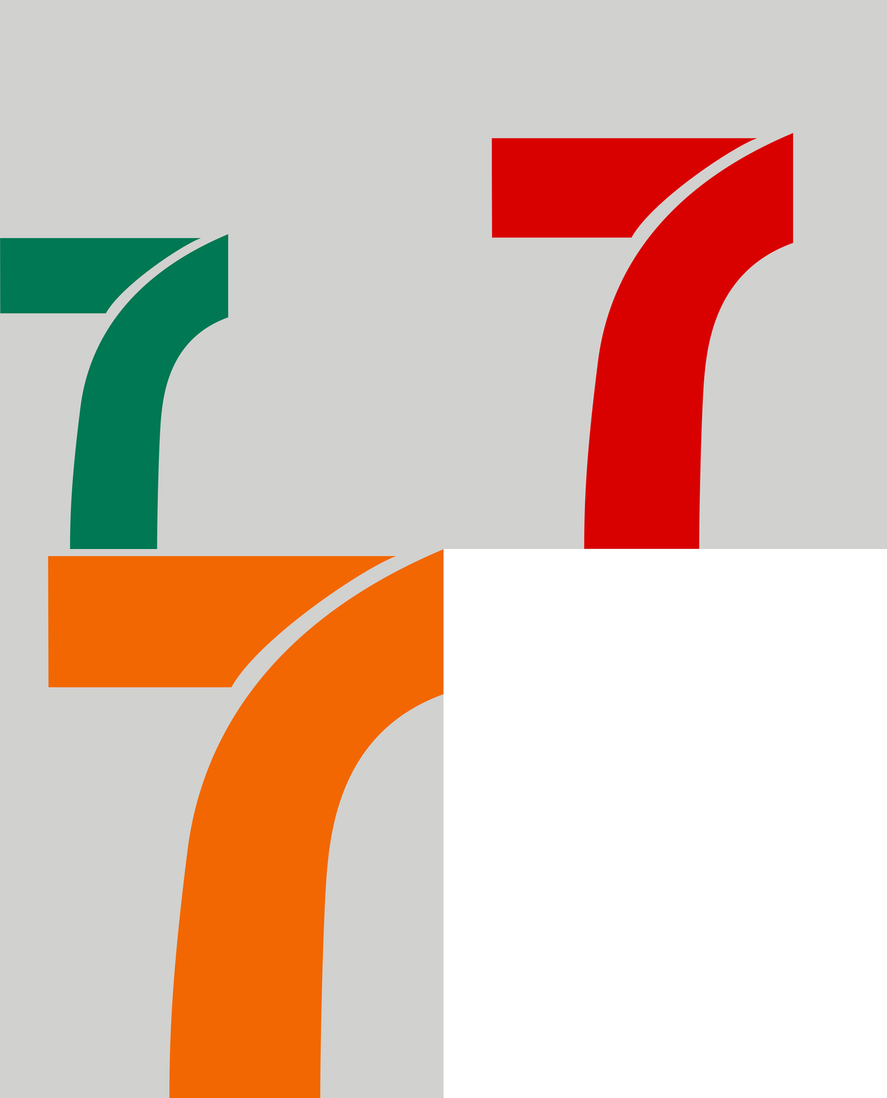
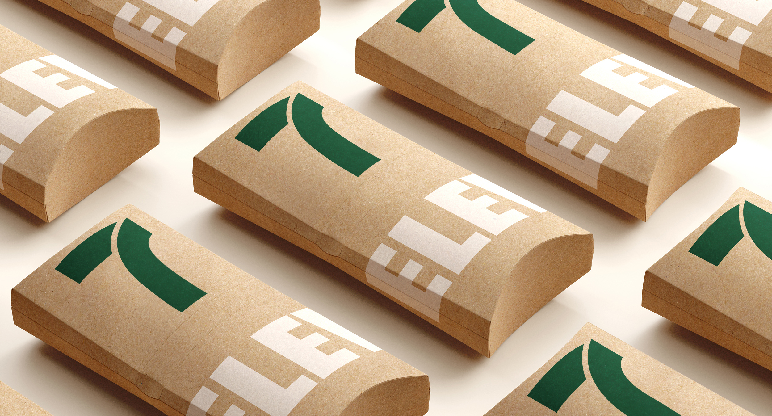
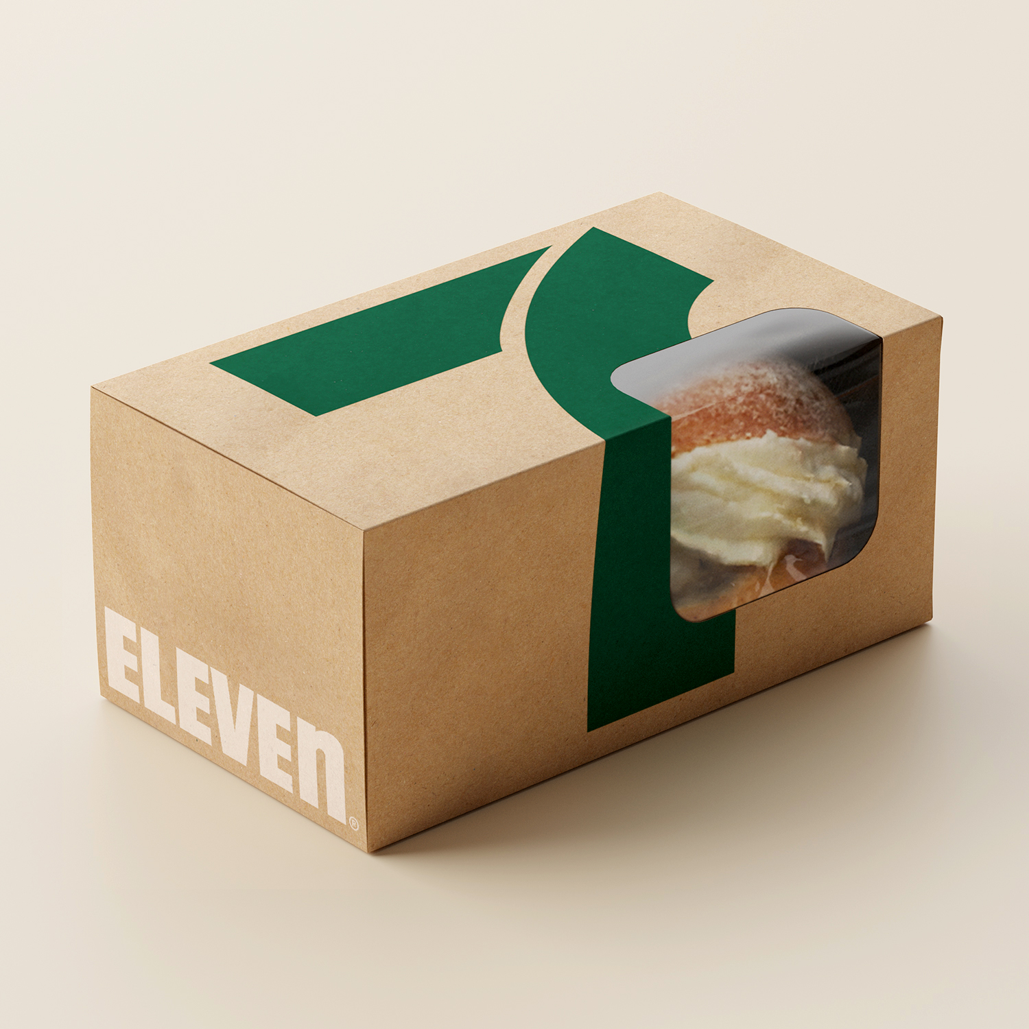
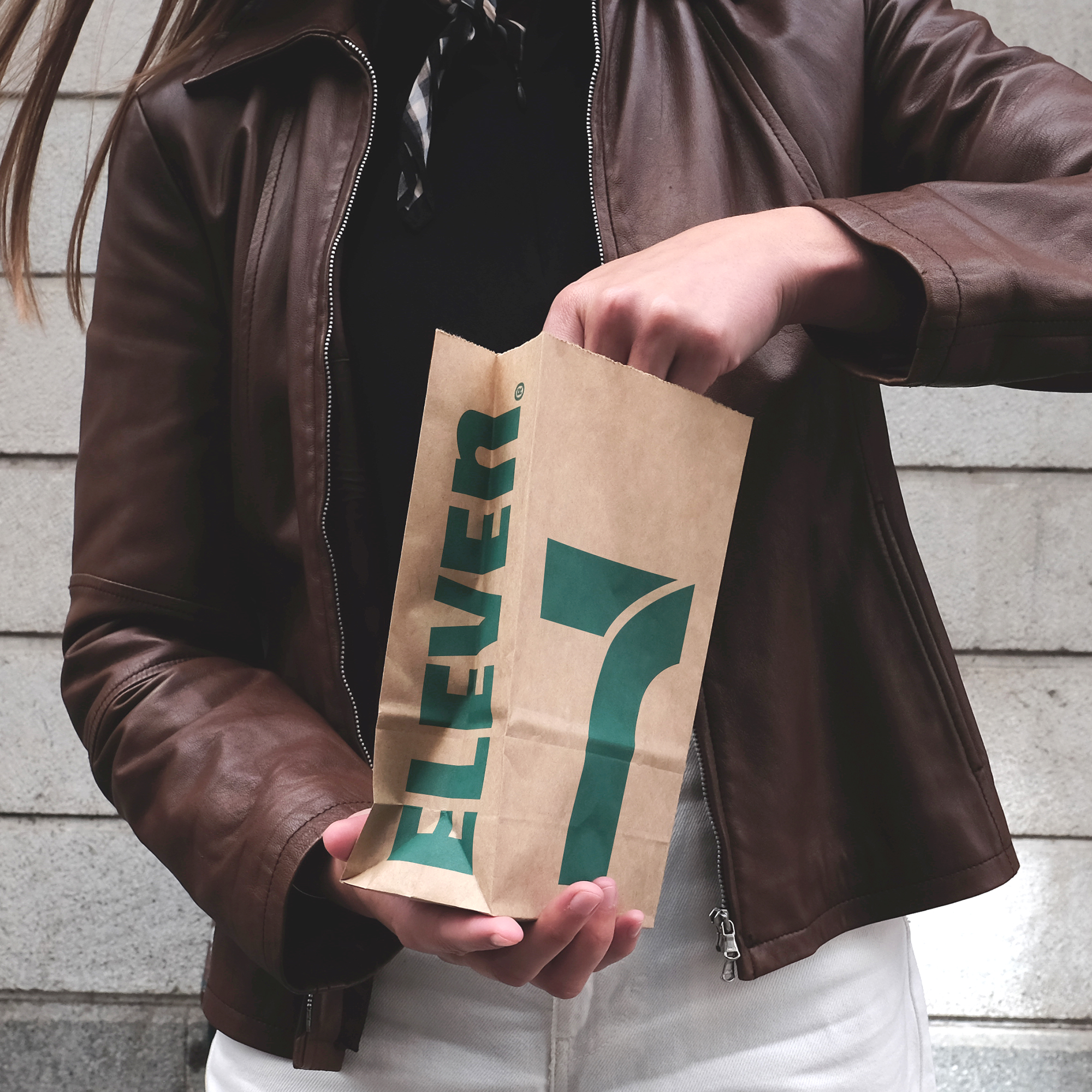
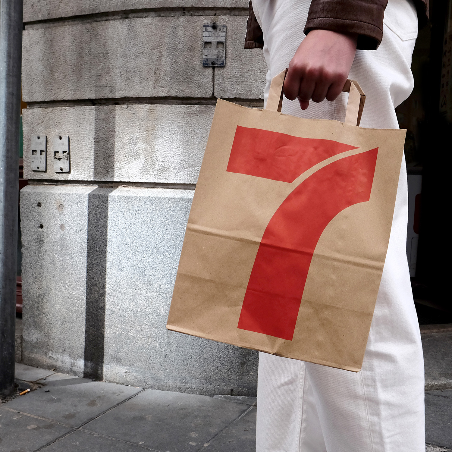
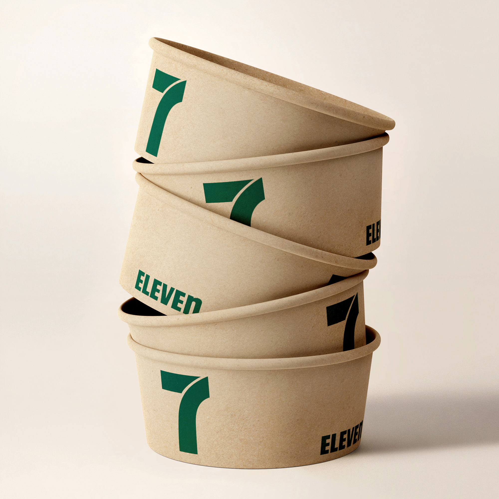
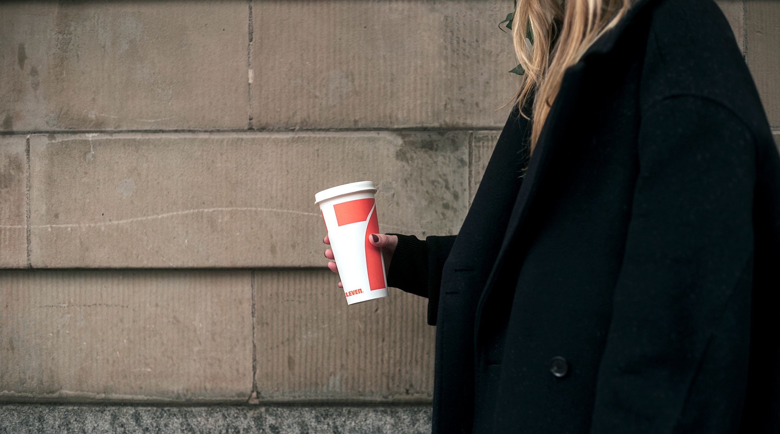
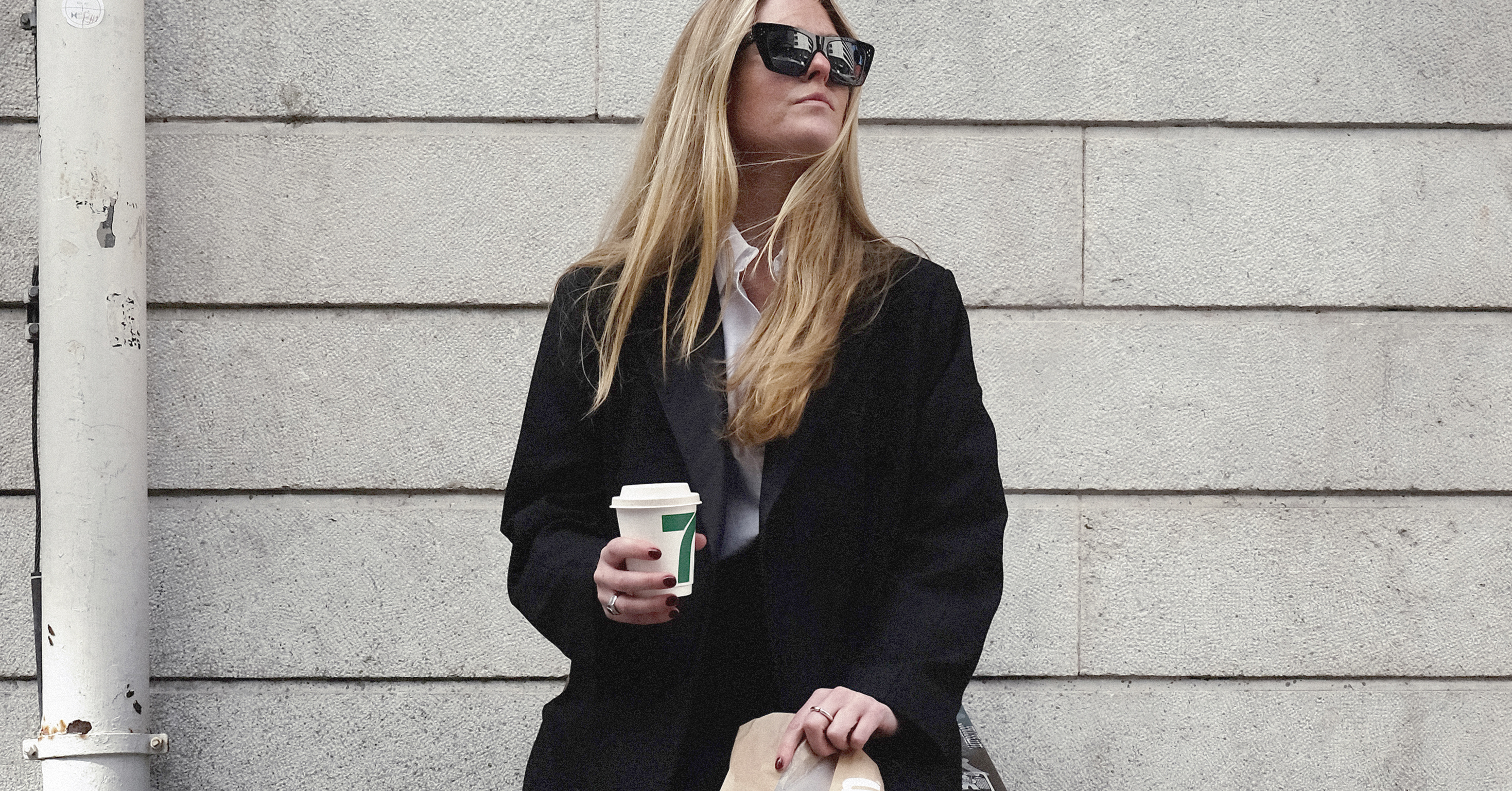
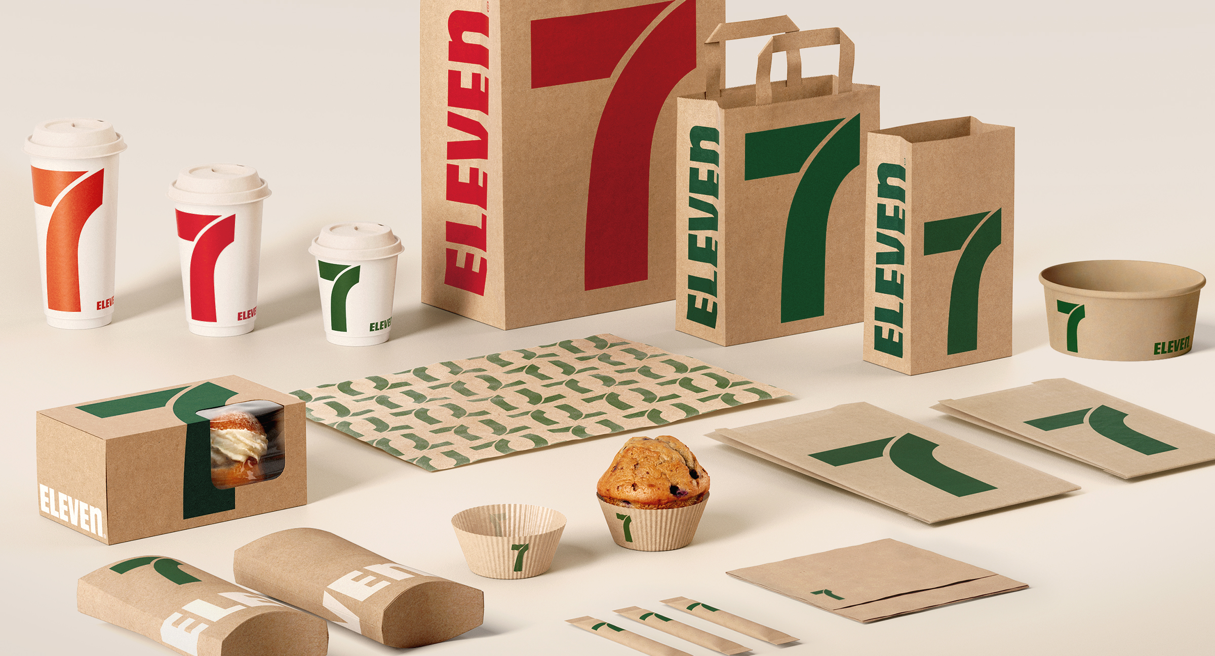
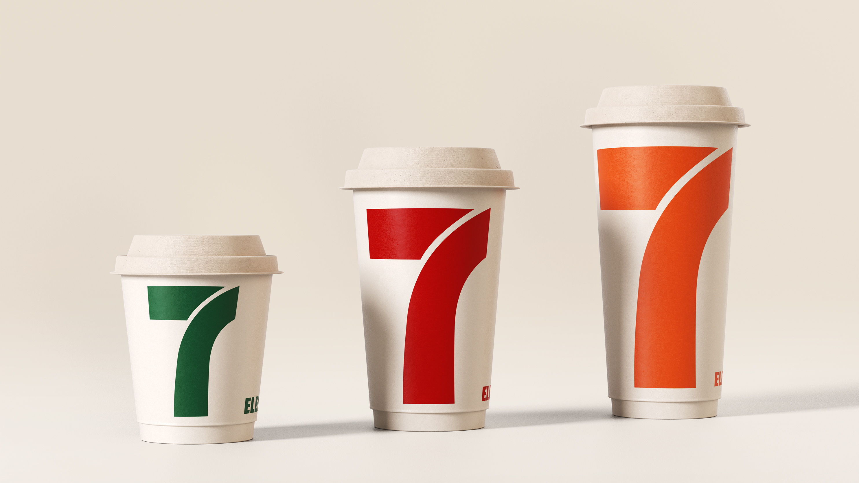
7-Eleven tasked us with exploring various routes before settling on a winning approach. However, there were certain key elements that all options had to share: visibility, clear brand recognition, and a coolness factor. The client also emphasized the design's ability to contribute to a specific lifestyle associated with their stores. Ultimately, the winning route turned out to be the simplest one, in the best way possible. After all, why complicate things when you have the best assets to make a bold statement and be straightforward? We centered the entire design around the iconic logo, leveraging its fame. By incorporating variations in execution and employing different color codes, each of the 20+ units emerged as a strong individual while maintaining a cohesive and cool overall appearance. The design generated significant media coverage, going viral on Twitter in Japan, garnering over 5 million views, 50,000 likes, and 3,000 retweets. Furthermore, the design is on the verge of expanding to other countries, serving as proof of its effectiveness.